Friends of the Earth
The UK's largest grassroots network dedicated to protecting people and planet. Friends of the Earth is a climate justice campaignig organisation that has been active for 50 years.
Midweight graphic designer 2021–current
Graphic design, brand, creative direction, and campaining.
Work upload in progress...
Midweight graphic designer 2021–current
Graphic design, brand, creative direction, and campaining.
Work upload in progress...


Insight
Publishing has an immense reliance on materials and energy. Too often little thought is given to the environmental effect of these production processes. Designers are a product of the industry and are removed from the impact their choices have.
Solution
Transparent is a publication curating research and opinions on how publishing can be more sustainable. The book itself is a manifestation of the approaches explored inside and is a tool for designers to reference before any publishing project.
Process
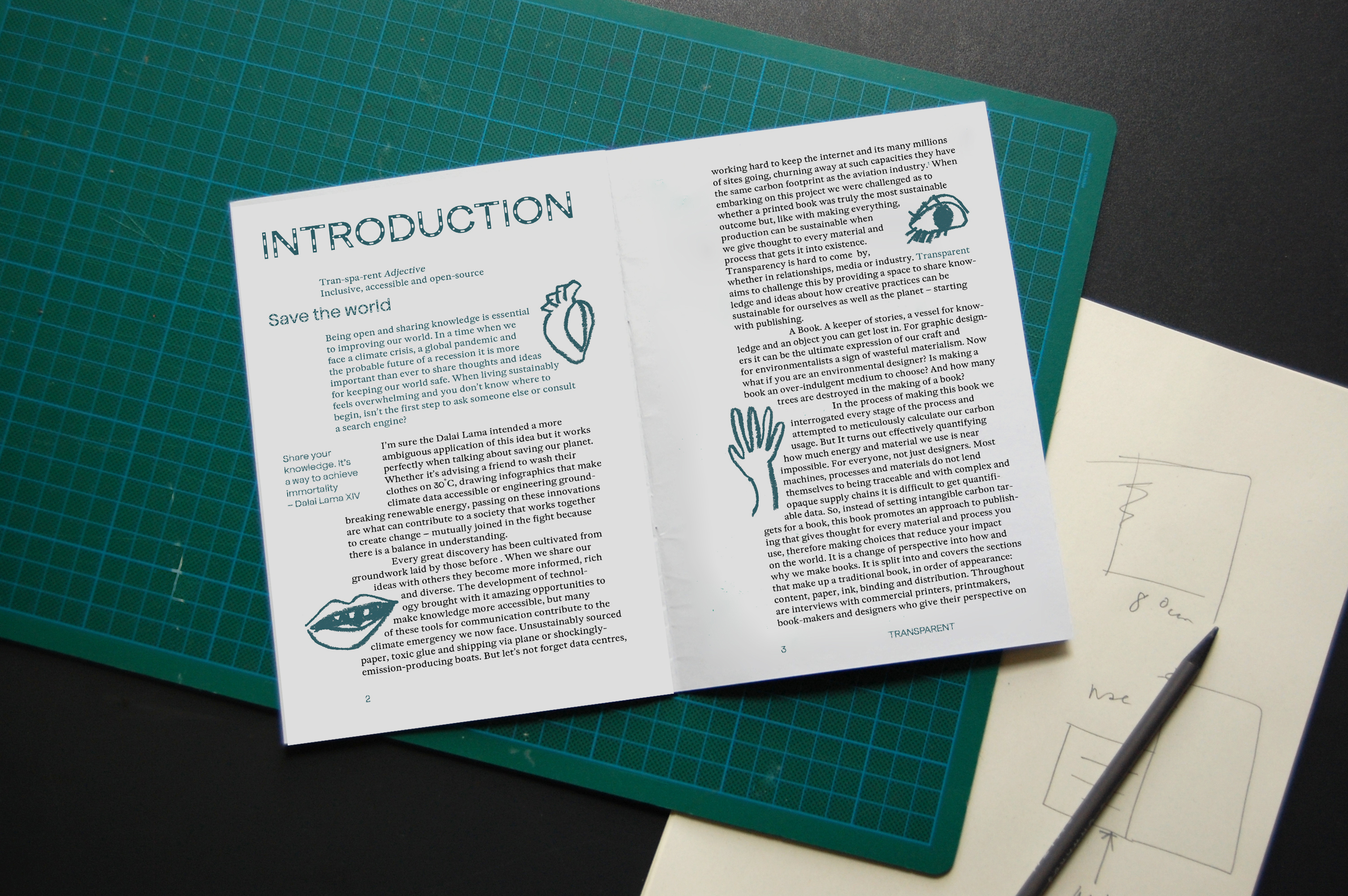
What started as an open brief about sustainability, took me deep into the manufacturing processes of ink, paper, and binding. My intention was to find a carbon neutral way of crafting a book (by hand) to then publish these findings for others to use. I realised instead that I needed to curate the best of the worst solutions that already exist, helping designers be sustainable in a more accessible way.
Roles
Design, editing & illustration
With Ewan Leslie
Illustrations by Daisy Tortuga
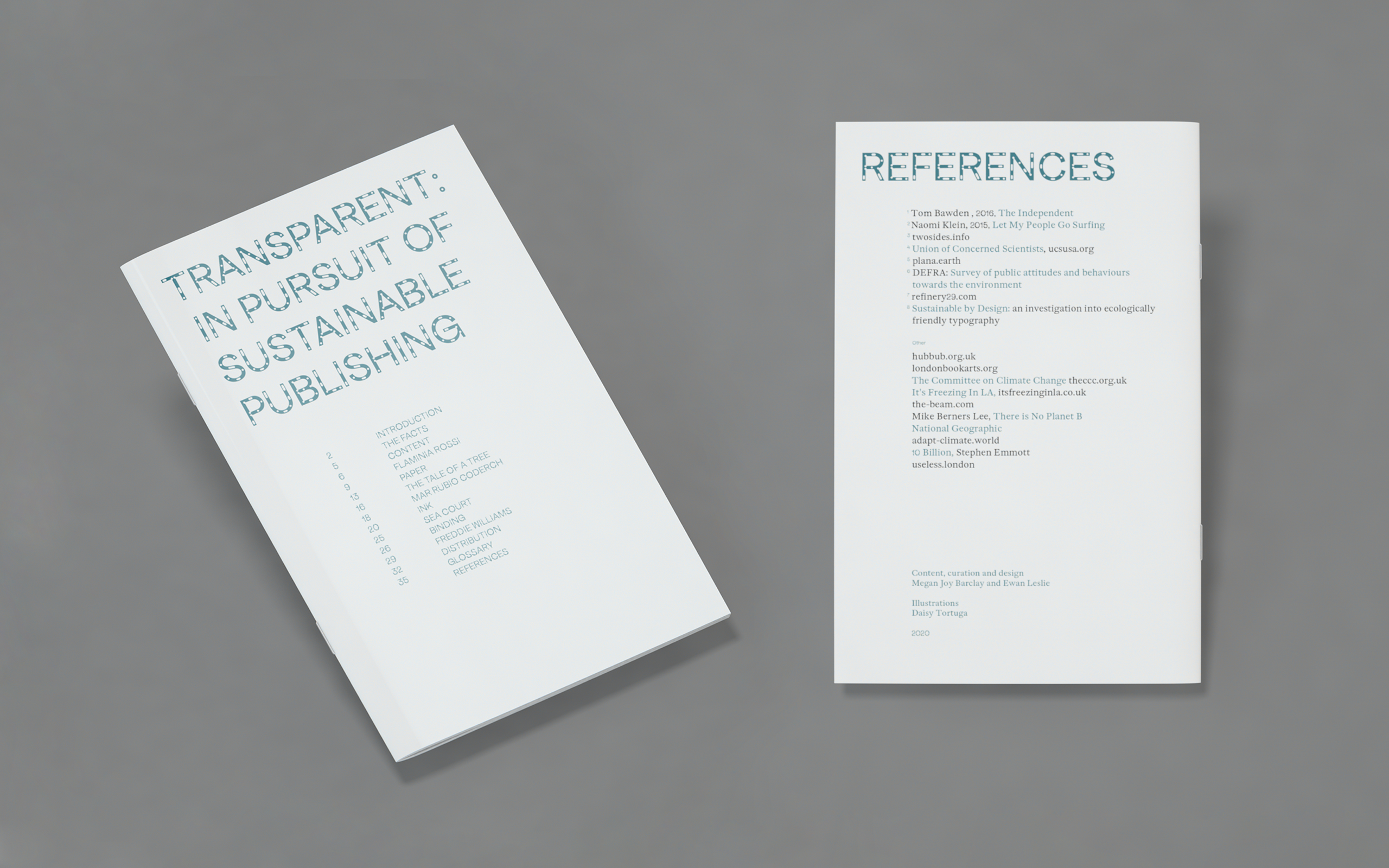

Transparent explores the five typical things that make up the production and delivering of a publication: content; paper; ink; binding; and distribution. The written pieces offer tangible actions to make each stage of production more sustainable as well as encouraging a change of perspective on using materials in general.
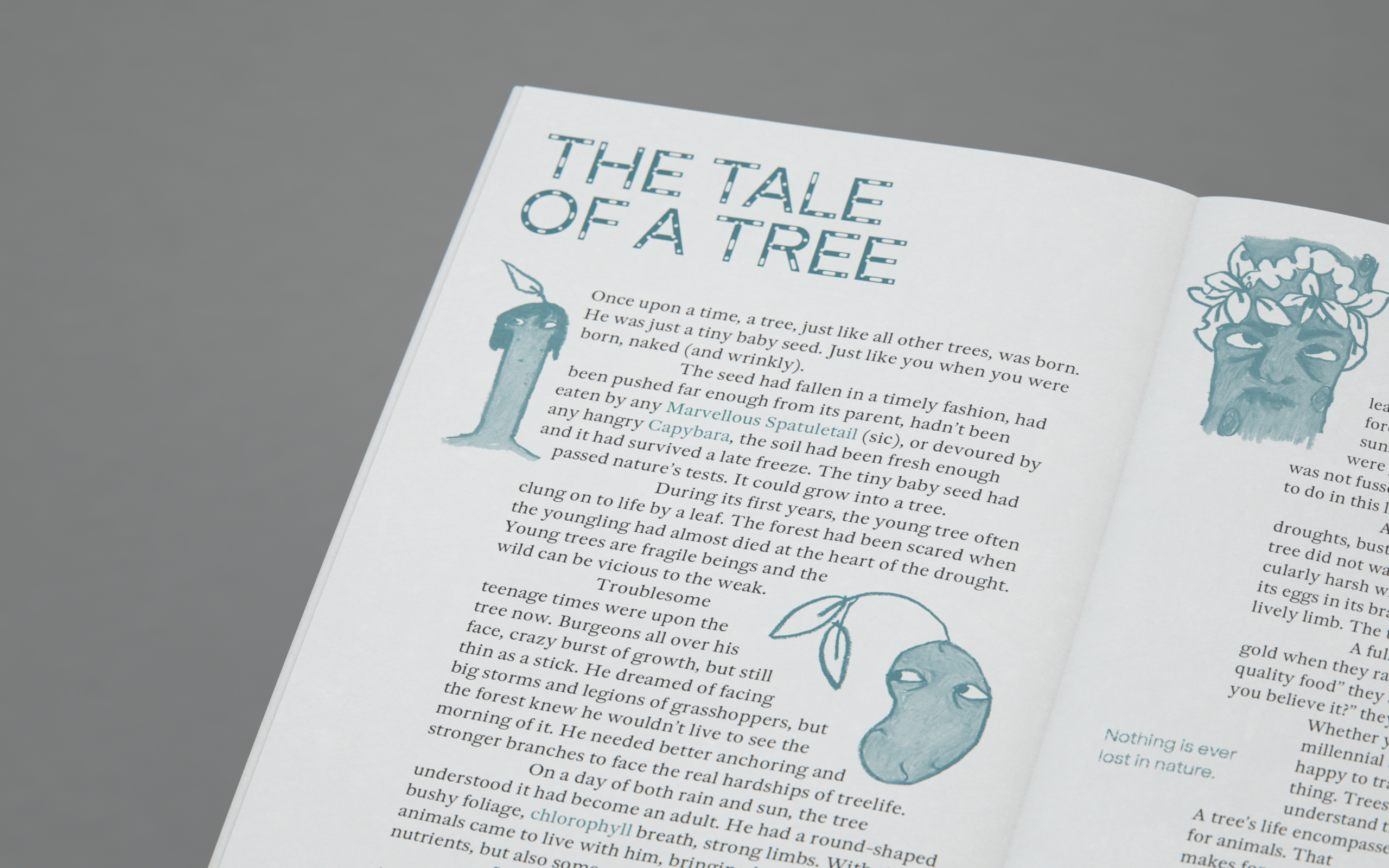
Included are interviews with practitioners and industry experts who share their insights on these topics. A fictional story and illustrations complete the content, offering light-hearted interpretations of the technical and practical information.
Included are interviews with practitioners and industry experts who share their insights on these topics. A fictional story and illustrations complete the content, offering light-hearted interpretations of the technical and practical information.
The publication, when physically realised, will be Risograph printed on uncoated paper, staple-bound and in a format slightly smaller than A5. These specifications create a beginning and end-of life that has the least impact on the environment.


Insight
During the centenary of the Bauhaus the significant contribution of GDR designers deserved a platform. Curators at a museum in the East of Germany made this possible and invited me and 6 other students to design the exhibition.
Solution
Our branding, scenography and catalogue celebrates the resources they’re made from, in-keeping with the ethos of Bauhaus. The objects and stories speak for themselves, our designs acting as vessels for the objects and history.
︎Eisenhüttenstadt, Germany
Roles
Production, visual identity, scenography & catalogue design
Production, visual identity, scenography & catalogue design

Above The exhibition invitation. Systematic design and a celebration of the objects was at the heart of our visual approach. Each piece of media needed to be bilingual (English & German) and we discovered and applied two GDR typefaces to compliment each language.
As part of a team of seven I worked with the curators at the Dokumentationszentrum Alltagskultur der DDR (Documentation Centre for Everyday life in the GDR) to design an exhibition about Bauhaus in the German Democratic Republic. We managed every stage of production: concept – prototype – creation.
This project was undertaken during a semester studying at Weißensee Kunsthochschule in Berlin but continued as a paid position post-study.Impact
The exhibition is on display for a year and will host thousands of visitors. Feedback from the opening, including from family members of those featured, assured us that we had done the designers work and stories justice.
The exhibition is on display for a year and will host thousands of visitors. Feedback from the opening, including from family members of those featured, assured us that we had done the designers work and stories justice.

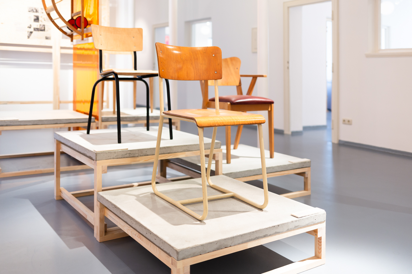


Above The Exhibition. Timber and concrete were chosen as practical and neutral yet beautiful materials to build structures. We printed the supporting timeline onto complimentary plywood and used blocks of transparent colour as wayfinding.
Our involvement from start to finish was complete and even involved spending a weekend on site mixing, pouring and moving the concrete elements.


Above Exhibition catalogue published by M-Books
Photography
Exhibition: Kevin Fuchs
Catalogue: Fay Nolan
Photography
Exhibition: Kevin Fuchs
Catalogue: Fay Nolan
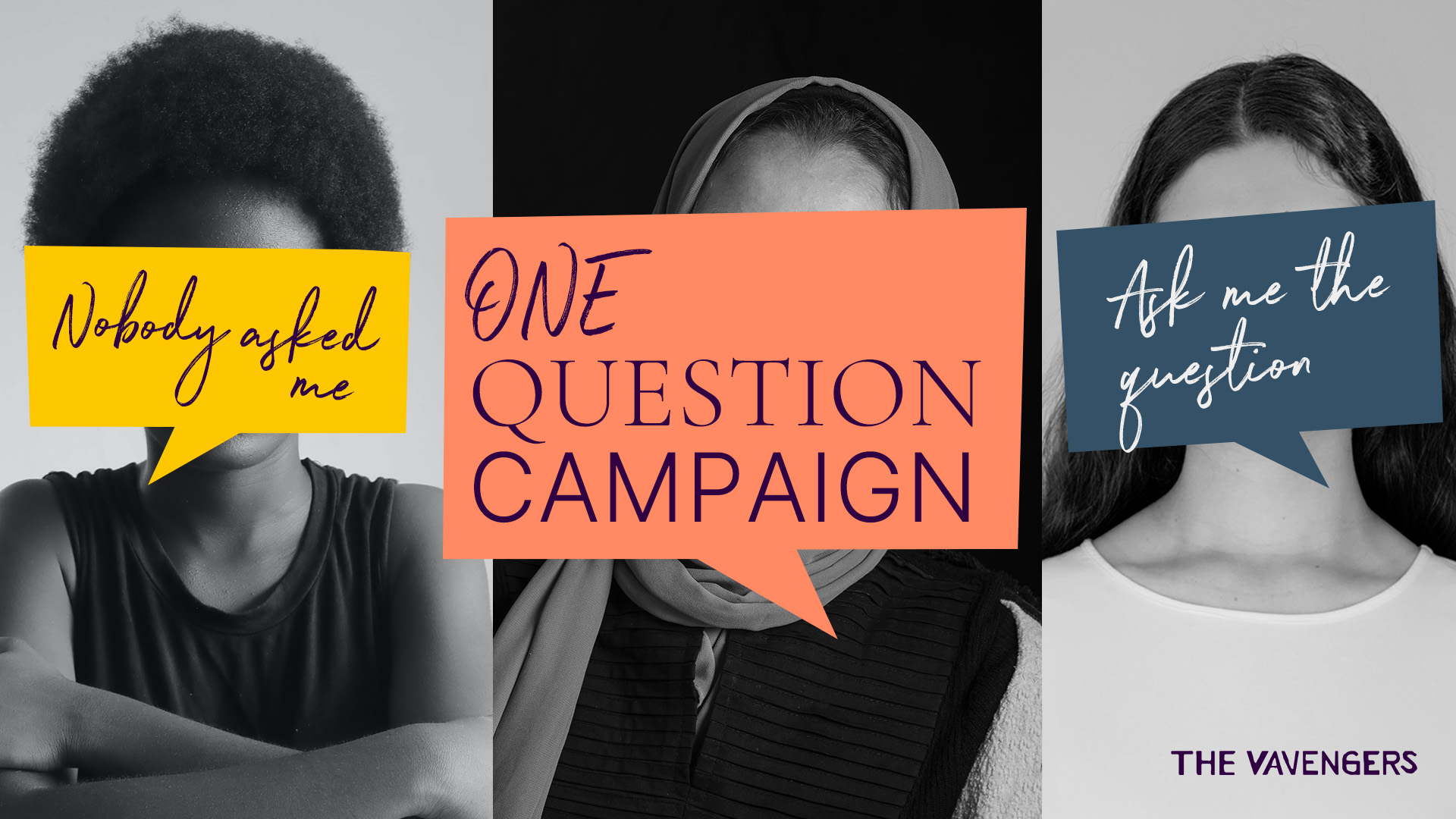
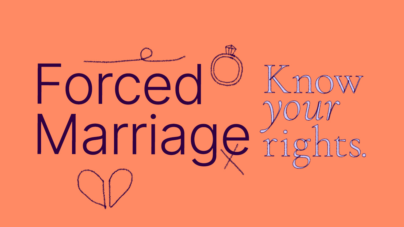
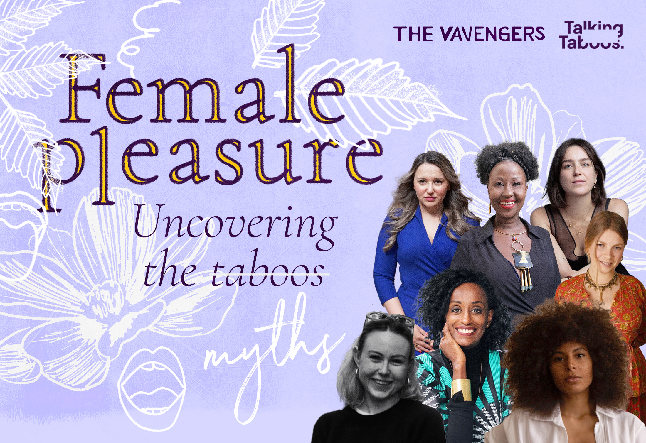
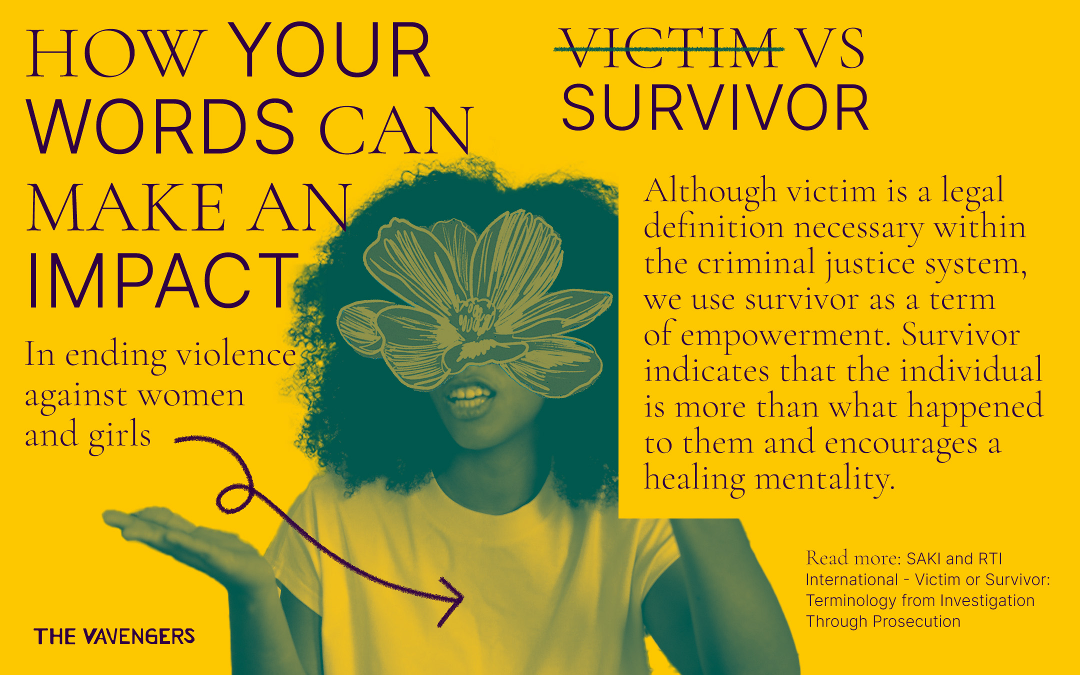
The Vavengers
A charity working to end Female Genital Mutilation/Cutting and all other forms of Violence Against Women and Girls.
Roles: Creative director, campaining, copywriting and operations | 2021 – 2024.
Work upload in progress...
Roles: Creative director, campaining, copywriting and operations | 2021 – 2024.
Work upload in progress...
TBC...
Insight
mimycri is an established non-profit covering topics of migration and sustainability. How can their communication stand out in these crowded spaces?Solution
I work closely with the co-founders to expand their brand identity, a visual voice that is echoed in unique content for every new campaign.Roles
Brand management, visual communication, copywriting, filmmaking & social media︎Berlin
Introduction
What started as an internship (May – July 2019) has turned into a long-term relationship. Building on mimycri’s already established brand I worked closely with the co-founders to develop more coherent and engaging communication. The visual manifestations are diverse and include: a number of photographic and written pieces [1]; the creation of brand guidelines and development of additional elements [2]; editorial media [3]; and a campaign video sharing the rich story of mimycri products, while calling out IKEA [4].[1] Art Direction & writing
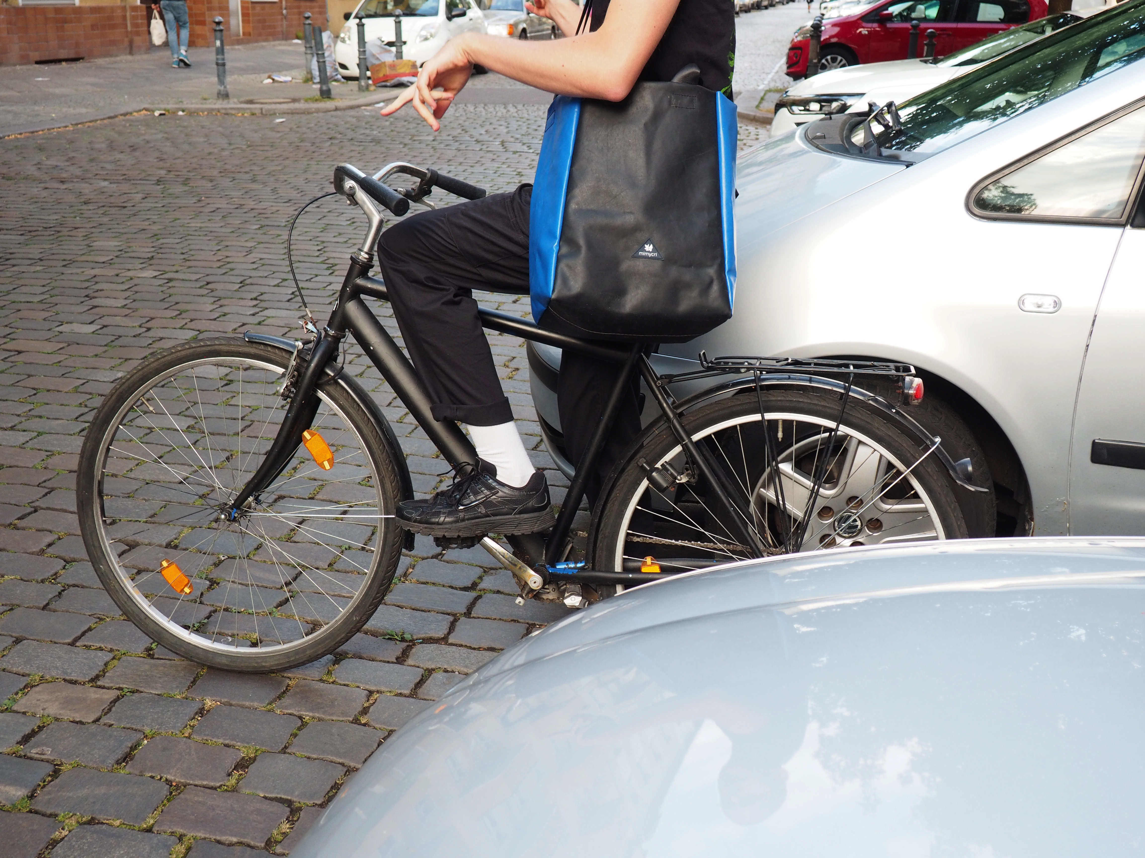
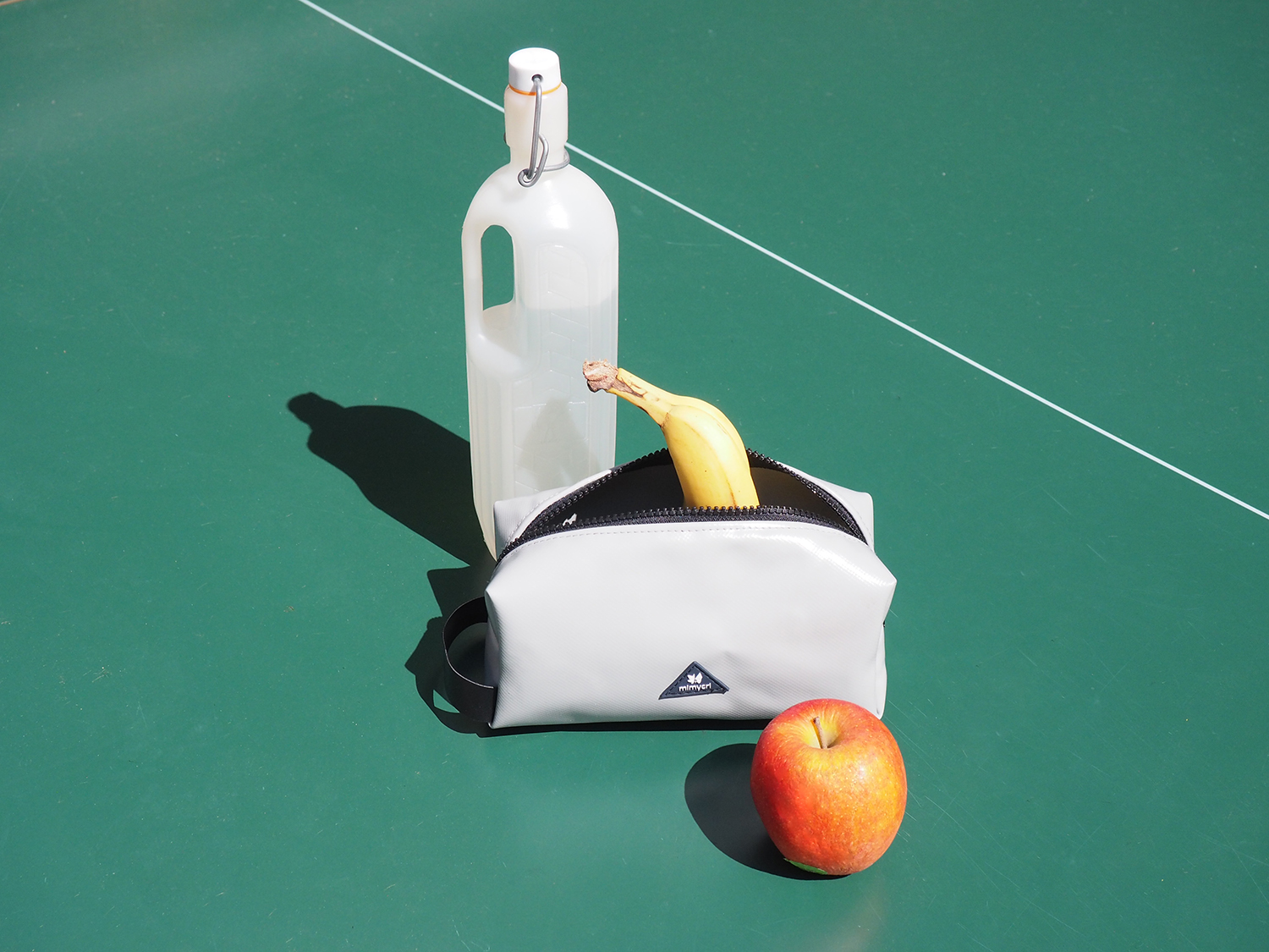
Left 5 things you can do with your mimycri bag
Right ‘It looks like a washbag’
Left 5 things you can do with your mimycri bag
Right ‘It looks like a washbag’
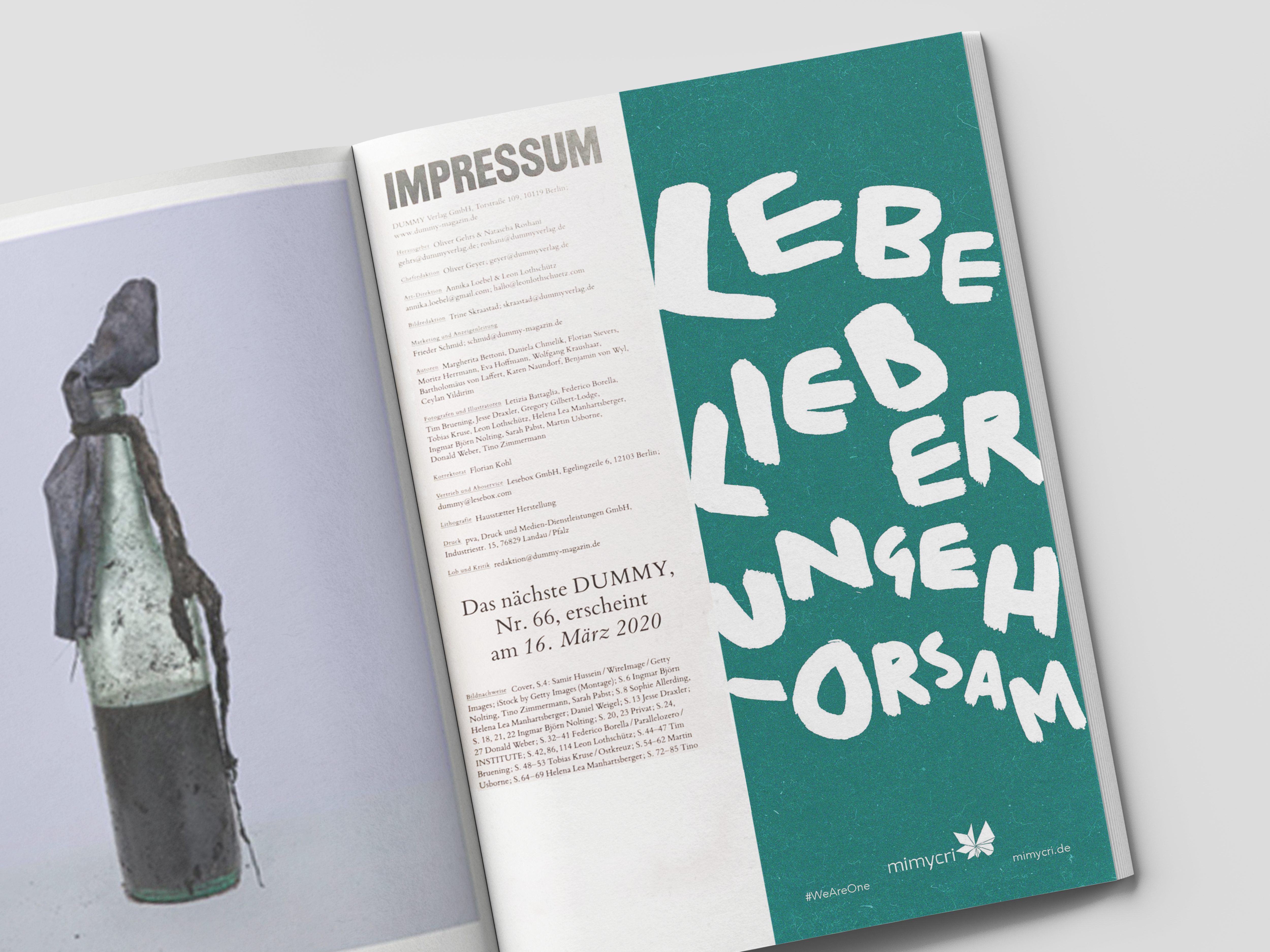
[2] Advertising editorial in DUMMY magazine. Translation: ‘RATHER LIVE DISOBEDIENT’
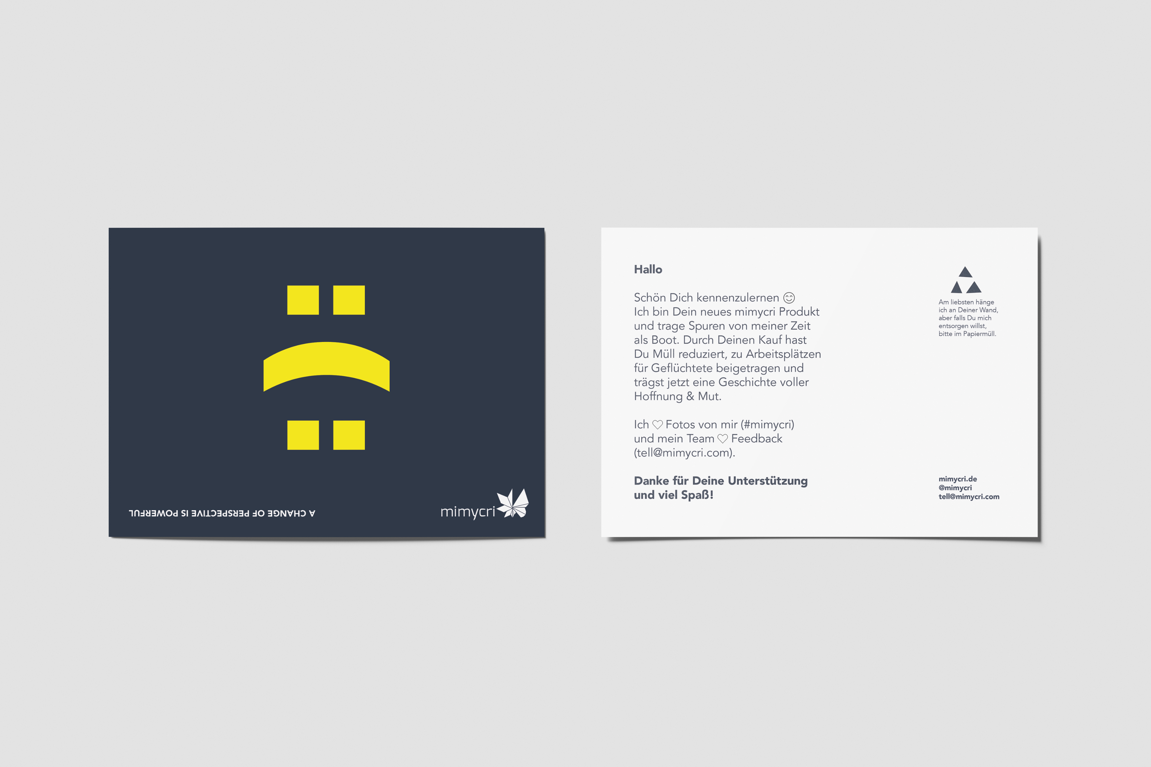
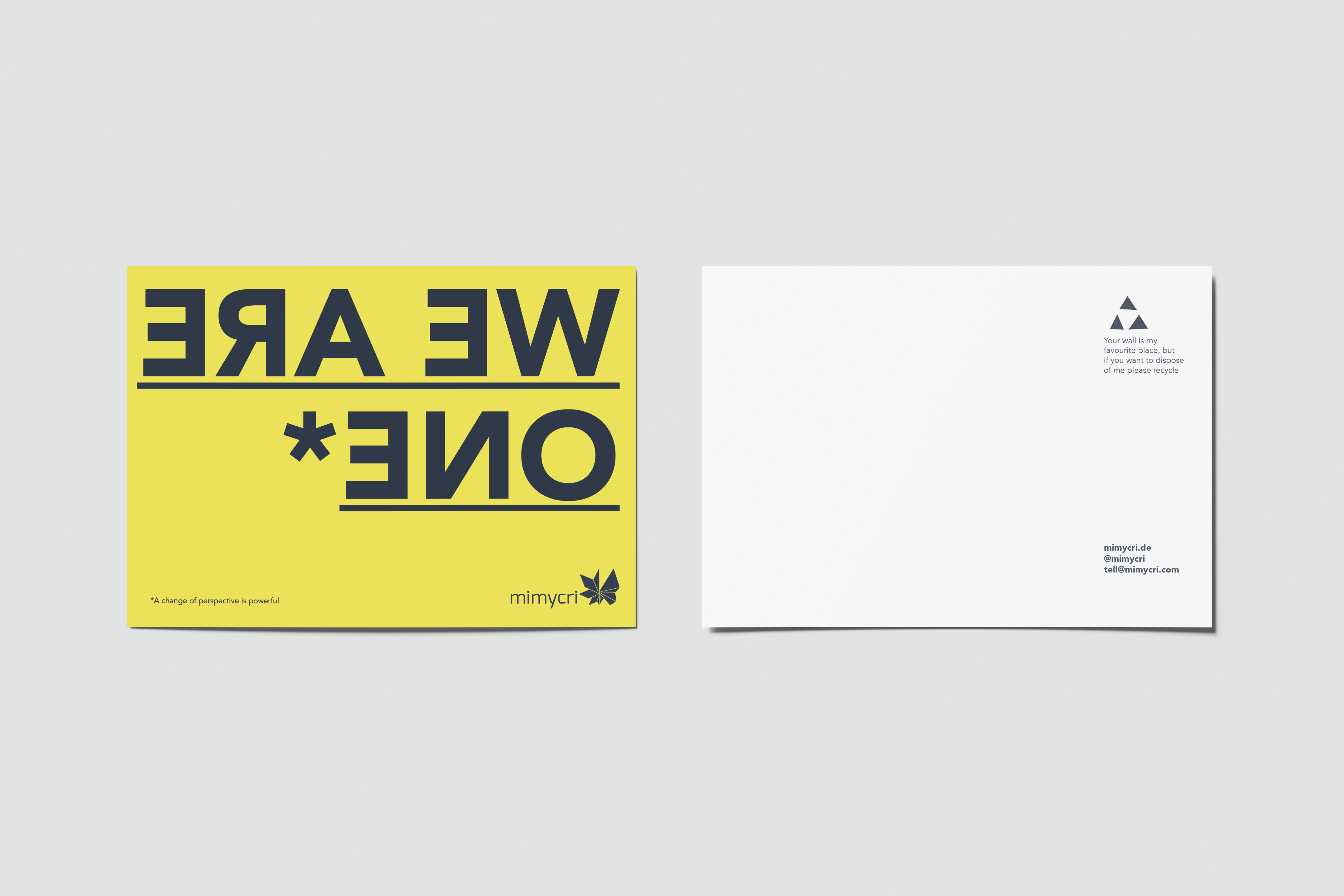 [2] Postcards are included with every mimycri order, available in German & English
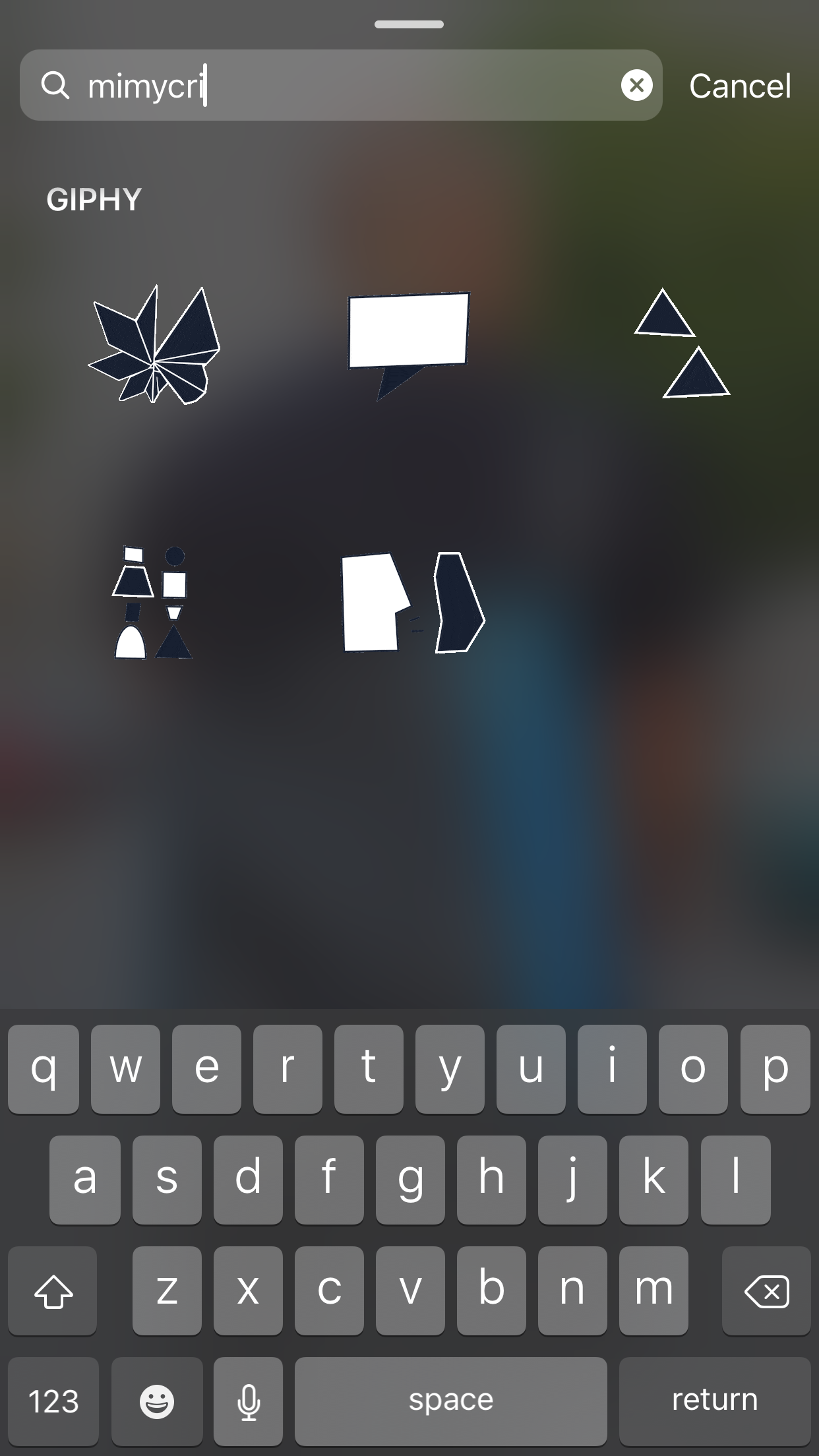
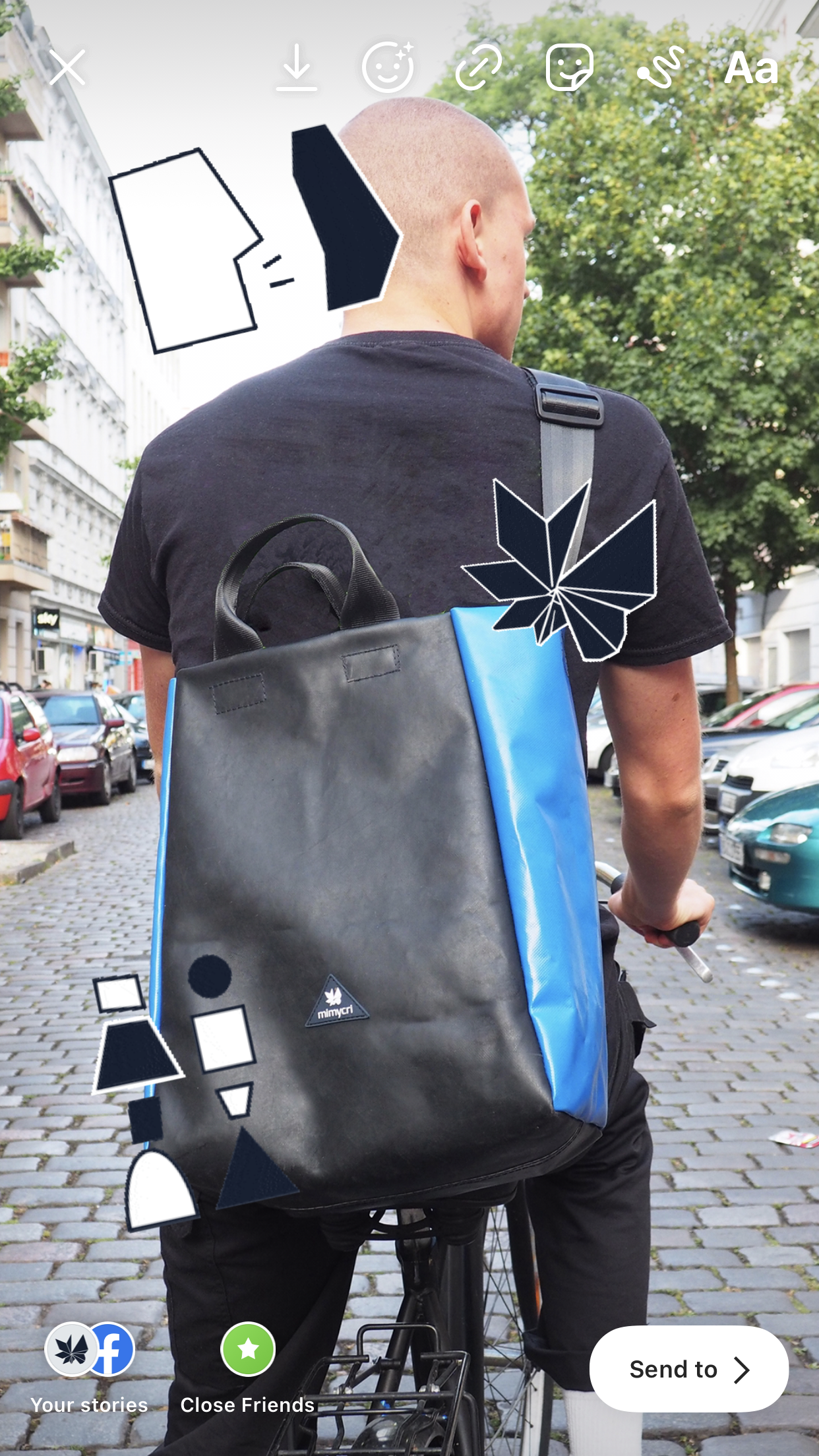
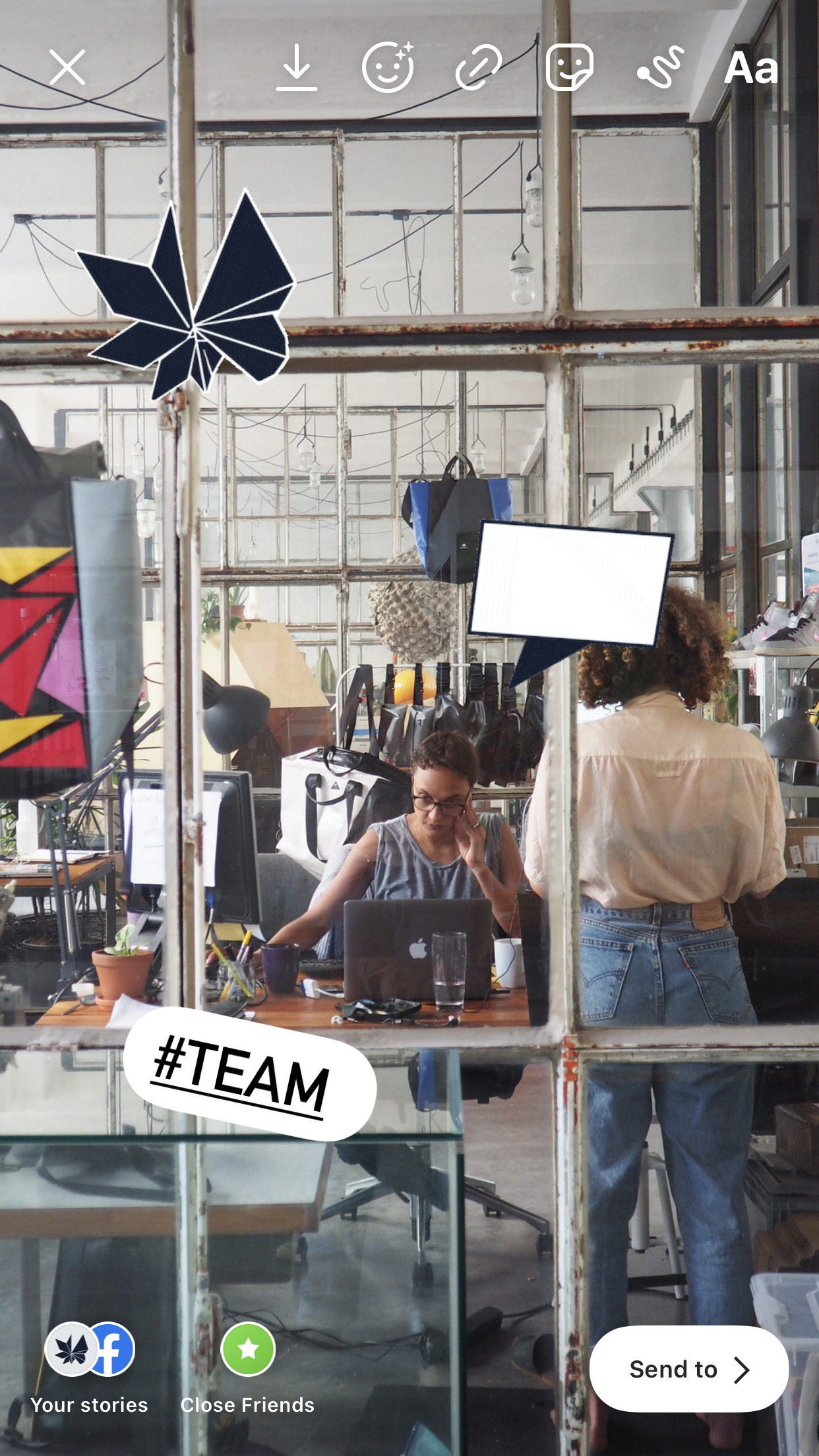
[2] I developed the branded icons into animated stickers for the public and our team to interact with
Ikea campaign
In 2017 Balenciaga released a leather bag that mimicked the design of an IKEA Frakta bag but with a ridiculous pricetag and questionable manufacturing. As is mimycri’s mission, we decided to offer a change of perspective – the mimycri tote bag being the perfect vessel.
The campaign was initiated by the co-founders but I led every stage of production: copywriting, photography, design, filming and release.
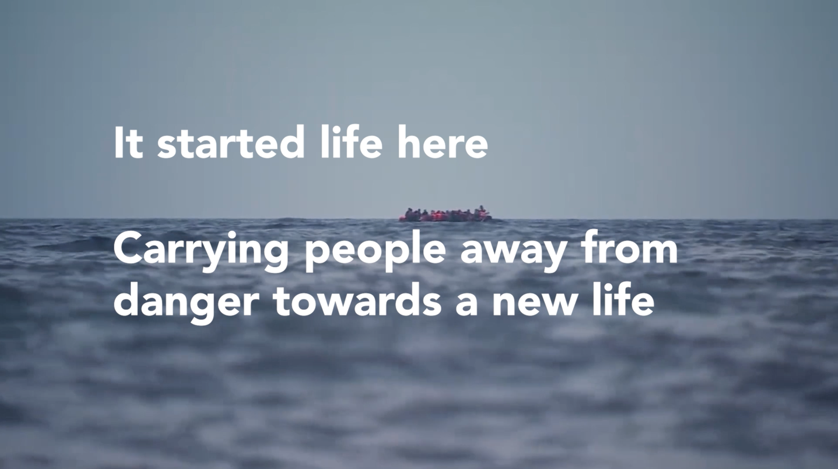 [4] Film still from mimycri x IKEA
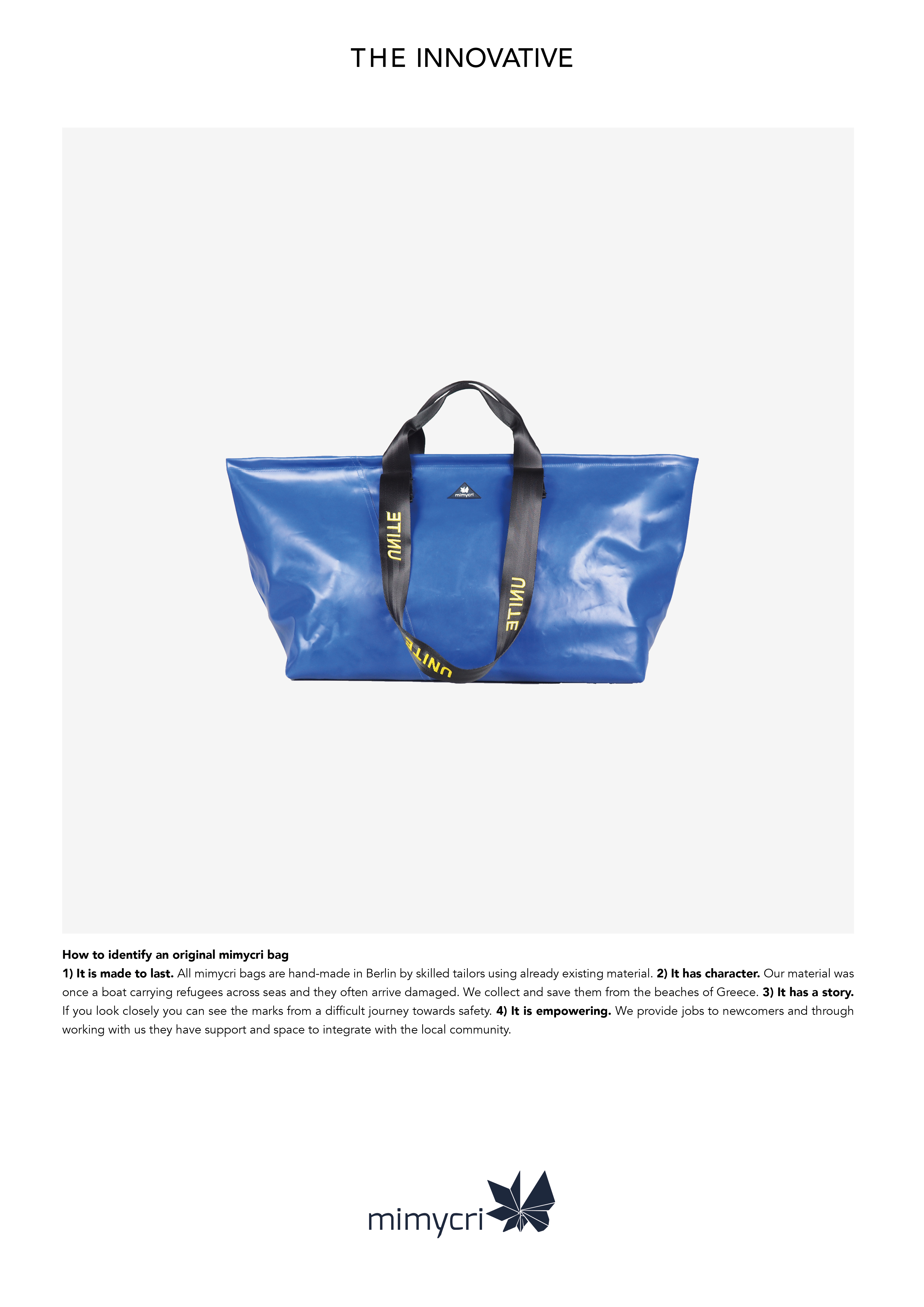 Above Re-interpretation of an IKEA ad
Above mimycri x IKEA campaign video: filming, editing and art direction by me